Download PDF: ISPL Blog – GIS Technology
A map is a representation of the environment and surrounding features presented graphically. An effective map has the power to elevate a report or document and help to highlight the overall intent or story behind the work. Maps should be useful and add value to the report or data that they support, hence, to be effective they need to present the correct data in a visually effective and appealing way.
Geographic Information

Source: QGIS
Geographic information or geospatial data relates to data which is stored against coordinates allowing the data to be used to make maps. A Geographic Information System (GIS) is the software used to analyse spatial data and to create maps. ArcMap and MapInfo are both examples of GIS software used for this purpose. Another great GIS is QGIS which has all the functionality of a paid GIS and as opensource software, this program is available to download free.
What Makes a Great Map?
Spatial data is simply lines, points and polygons until it is turned into something captivating which tells the underlying story of the data. Turning spatial data into a great map can take time and requires an understanding of what the spatial data is showing and how this links in with the overall objective of the map. A great map should have several key elements.
- In the right projection. If the spatial data is not in the right projection features can appear incorrectly creating confusion in your map.
- Clear symbology. This is critical and poor colours or symbols can make a map confusing. Colours and symbols should be familiar and intuitive for example it makes sense to make water blue not green.
- Visual hierarchy. Are the layers appearing correctly or are some features hidden? The order of layers can significantly influence the appearance of the final map.
- The correct base layer. Selecting the correct base layer for the map provides the framework for displaying the rest of your spatial data. A base layer can include satellite imagery, topographical/cadastral information, ortho-referenced images or scanned maps.
- The right amount of detail. This can be tricky to get right but a map should show enough detail to provide context of the location and surrounding features but not draw attention away from the purpose of the map.
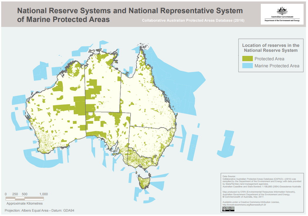
Source: www.environment.gov.au
OK, but where do you get the Data?
An overwhelming amount of spatial data is available online, you just have to know where to look.
Each Government Department in Western Australia collates and manages its own data. Once upon a time you had to navigate each Department website to track this data down. Thankfully these data sources are now being transferred into one data portal, greatly reducing the time taken to source data. This can be accessed through the data.wa.gov.au website. Some datasets require a SLIP login to access.
Another great source for Australia wide datasets is the Geoscience Australia data portal. You can find all kinds of useful data from soil and water to weather and even historic records.
Each Commonwealth Government Department also collates and manages a range of spatial data. This is has been collated into one data portal and is regularly updated, accessed through the National Map website. National Map gives you the ability to view spatial data before downloading or linking the data to your GIS program.
For those who are time poor or who don’t have access to a GIS program, spatial data can be viewed and manipulated through web mapping programs. These allow you to view spatial data and make basic maps. Some useful web mapping programs include:
- National Map
- Geoscience Australia Online Tools
- DAFWA NRMinfo for WA soil, vegetation and land quality information
- DAFWA WeedWatcher for WA weed records
- DMIRS GeoView and Tengraph for WA mining and geological information
- Project Dieback Public Map and Dieback Information and Delivery Management System for Dieback infected areas and management
- NatureMap for WA flora and fauna records
- Atlas of Living Australia for Australia wide flora and fauna records
With the right spatial data, a map really can tell a 1000 word story and be an effective addition to documents. If you require assistance with mapping or are interested in analysing spatial data please contact Integrate Sustainability on enquiries@integratesustainability.com.au or (08) 9468 0338 to see how we can help.